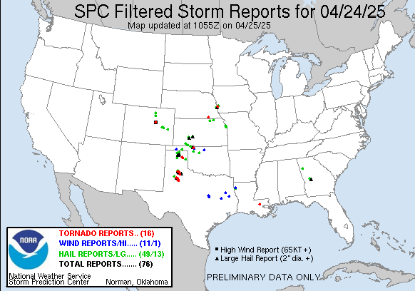
StormChasingUSA.com typically peaks at times when there is an outbreak of tornadoes (given all the attention from media I guess) and typically has a higher average during tornado season. I have noticed this a couple of times when I look at my stats from the website.
By reversing the image I realized this actually looked like a tornadic sky with every tornado outbreak visually represented with a “tornado peak”. The effect would actually have been more clear if I would have reduced the amount of days, since the larger peaks tilts the scale a bit. But, I didn’t feel like re-doing it all after I realized this…